Plotting Vowel Formants
In this tutorial, I’ll demonstrate how to create a basic vowel plot using the ggplot2 library in R. Only the first two formants (F1 & F2) will be plotted, since they are, in general, all that’s required to distinguish between most vowels. That and ggplot2 can’t produce 3D graphics. ;)
Prerequisites
I’m going to assume you already have an R environment set up and ready to go, along with some basic experience with R. Yet, even if you’re new to R, this post shouldn’t be too difficult to plod through… especially if you cut and paste.
Also, since this particular post is about vowel formants, some phonetic knowledge is required if– say you want to gather your own data or understand what exactly is being plotted here.
The Data
For the sample data, I recorded myself saying a few words in Praat, both in English and Spanish so that the the vowels from the differing language could be plotted one against the other. I coded the measurements using Excel. While this isn’t a scientific study, and nothing will be gleaned from using such little data, the plots will be interesting to gawk at.
R Libraries
First things first, import ggplot2 and plyr.
library('ggplot2')
library('plyr')
Import the Data
I suggest you take a take a look at the CSV file before you view the summary in R. Since the labels we’ll be using to represent the vowels are from the International Phonetic Alphabet (IPA), the encoding has to be set to UTF-8, otherwise R will not recognize the special characters, and they will be distorted when you plot them. Here we use the read.delim function to import the CSV into R as a data-frame.
data <- read.delim('vowels.csv',
               header=1,
               sep=",",
               encoding="UTF-8")
Let’s review the data. Print data to the console and you’ll see a small data-set of 13 observations.
data
##    X.U.FEFF.words  F1   F2    vowel language
## 1            heed 261 2049        i  English
## 2             hid 388 1947 <U+026A>  English
## 3            head 439 1896 <U+025B>  English
## 4             had 577 1769        æ  English
## 5             hod 694 1141 <U+0251>  English
## 6           hawed 589  785 <U+0254>  English
## 7            hood 312 1303 <U+028A>  English
## 8           who'd 312  980        u  English
## 9             hut 568 1170 <U+028C>  English
## 10           hito 255 2090        i  Spanish
## 11          hecho 420 2035        e  Spanish
## 12          hache 711 1561        a  Spanish
## 13           ocho 433  795        o  Spanish
## 14           hube 346  680        u  Spanish
A Side note Regarding Excel.
Unfortunately, When Excel generates a file in UTF-8, “X.U.FEFF.”, is prepended to the file This explains the strange name for the first column, X.U.FEFF.words. It doesn’t really cause a problem, but being ugly, and awkward to remember and type, we rename the column to words as it was intended.
colnames(data)[1] <- "words"
data
##    words  F1   F2    vowel language
## 1   heed 261 2049        i  English
## 2    hid 388 1947 <U+026A>  English
## 3   head 439 1896 <U+025B>  English
## 4    had 577 1769        æ  English
## 5    hod 694 1141 <U+0251>  English
## 6  hawed 589  785 <U+0254>  English
## 7   hood 312 1303 <U+028A>  English
## 8  who'd 312  980        u  English
## 9    hut 568 1170 <U+028C>  English
## 10  hito 255 2090        i  Spanish
## 11 hecho 420 2035        e  Spanish
## 12 hache 711 1561        a  Spanish
## 13  ocho 433  795        o  Spanish
## 14  hube 346  680        u  Spanish
Here we’re going to subset the data-frame into two separate variables so that we can work with either language individually. We’ll continue with English for the moment.
eng <- subset(data, data$language == "English")
spa <- subset(data, data$language == "Spanish")
A Basic Plot
A basic plot in ggplot2 isn’t too difficult to create. Every plot requires three components:
- data – the data-frame
- aesthetic mappings – connects data to the layer
- layer – the type of graph
Our data-frame, eng, is directly passed to the ggplot function. It will be mapped by aes() the to visual properties in the graph (the layer). Lastly, the layer is usually created with a geom function. The layer can be thought of as the type of graph, such a bar chart or scatter plot. A simple scatter plot can be created with geom_point(). Below, the three elements are given their own line in the same order.
Unique to ggplot2, the plus sign (+) allows you to add plot components together.
ggplot(data=eng)+
  aes(x=F2, y=F1)+
  geom_point()
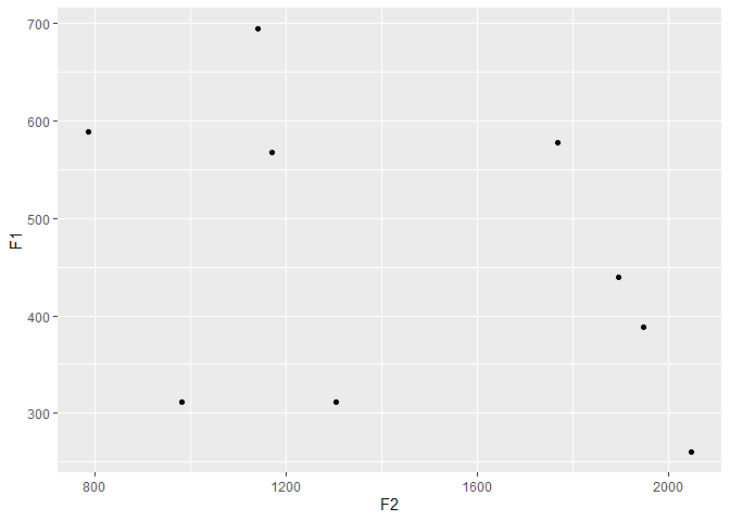
# A more idiomatic example of the above code.

ggplot(data=eng, aes(x=F2, y=F1))+
geom_point()
Rather than points representing each vowel, let’s arrange it so that the IPA symbol is plotted. Replace geom_point with geom_text. Inside aes() include the new argument, label, which we’ll assign the vowel column in our data-frame, eng. Let’s also pass the color attribute. By assigning the vowel column to color, ggplot2 will automatically assign a color to each of our labels.
ggplot(data=eng, aes(x=F2, y=F1,
                     label=vowel,
                     color=vowel))+
  geom_text()
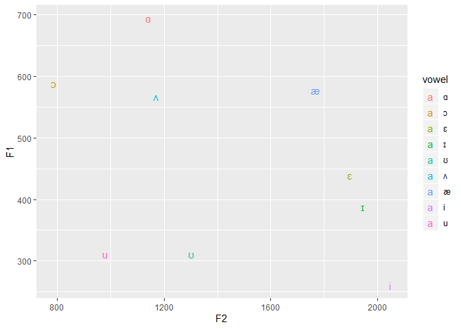
Traditionally, since F1 is associated with vowel height, and F2, vowel backness, should the axes be reversed, the plot will read very much like the IPA vowel trapezoid! Meaning a vowel to the right, is back vowel, a vowel to the left is front vowel, and the higher it is on plot the higher the vowel and the lower it is on the plot, the lower the vowel.
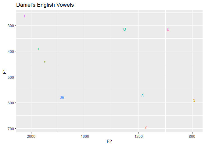
To reverse an axis, like the x-axis, we use scale_x_reverse() and for the y-axis, scale_y_reverse.
ggplot(data=eng, aes(x=F2, y=F1, label=vowel, color=vowel))+
  geom_text() +
  scale_x_reverse() +
  scale_y_reverse()

I’m sure you noticed the legend. Ugly. Let’s get rid of it, and add a title.
ggplot(data=eng, aes(x=F2, y=F1,
                     label=vowel,
                     color=vowel))+
  geom_text()+
  scale_x_reverse()+
  scale_y_reverse()+
  labs(title="Daniel's English Vowels")+
  theme(legend.position="none")
Let’s add another layer (another geom) to highlight my entire vowel space. First we’ll need to get the convex hull. While not necessary for a simple example, we’ll make a little function to extract it, to make things easier for when we plot the English and Spanish vowels on the same plot.
find_hull <- function(dataframe) {
  dataframe[chull(dataframe$F2, dataframe$F1), ]
}

eng_hull <- find_hull(eng)
To include the convex hull, lets add an additional layer,the geom_polygon and pass eng_hull as the data parameter.
ggplot(data=eng, aes(x=F2, y=F1,
                     label=vowel))+
  geom_text()+
  scale_x_reverse()+
  scale_y_reverse()+
  labs(title="English Vowel Hull")+
  theme(legend.position="none")+
  geom_polygon(data=eng_hull)

Now, you can change the color by adding a color to the fill attribute to a new aesthetic mapping in the geom_polygon. Since this is a new layer, we include a new aes function. Technically, we could add a fill attribute to the original aes, but then ggplot2 will choose colors for you. Why settle when you have such a wide breadth of colors at your disposal?
Notice how labels are a bit difficult to read being behind the polygon, let’s include the alpha attribute to make and make the polygon layer transparent.
ggplot(data=eng)+
  geom_text(aes(x=F2, y=F1,
                label=vowel,
                color=vowel))+
  scale_x_reverse()+
  scale_y_reverse()+
  labs(title="Plotting the English Vowel Hull")+
  theme(legend.position="none")+
  geom_polygon(data=eng_hull, aes(x=F2,y=F1,
                                  fill=language,
                                  alpha=.9))+
  scale_fill_manual(values = "thistle")

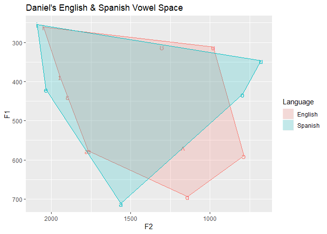
Alright, much better! So now that you can graph a single set of vowels into one space. Let’s include Spanish on the same chart. We’ll include guides(color=FALSE) to delete the additional color legend we don’t need. Try the code with and without it. We’ll use ddply to subset the dataframe based on the language and finds the hulls for both languages. This can also be done for individual vowels, but there isn’t enough observations in the example data.
lang_hull <- ddply(subset(data, F1 > 0), .(language), find_hull)

ggplot(data=data, aes(x=F2,
                      y=F1,
                      label=vowel,
                      color=language,
                      fill=language))+
  geom_text() +
  scale_x_reverse()+
  scale_y_reverse()+
  labs(title="Daniel's English & Spanish Vowel Space")+
  guides(color=FALSE)+
  geom_polygon(data=lang_hull, alpha=.2)+
  scale_fill_discrete(name="Language")
lang_hull <- plyr::ddply(subset(data, F1 > 0), .(language), find_hull)

ggplot(data=data, aes(x=F2,
                      y=F1,
                      label=vowel,
                      fill=language))+
  geom_text() +
  scale_x_reverse()+
  scale_y_reverse()+
  labs(title="Daniel's English & Spanish Vowel Space")+
  geom_polygon(data=lang_hull, alpha=.4)+
  guides(color=FALSE)+
  scale_fill_discrete(name="Language")

Plotting F2-F1
It’s also common to graph F1 over F2-F1, since it produces a plot more in tune with the IPA vowel trapezoid. We can add a new column to the data, with F2-F1 find the new hulls.
data$difference <- data$F2 - data$F1
lang_hull <- ddply(subset(data, F1 > 0), .(language), find_hull)
ggplot(data=data)+
  geom_text(aes(x=difference,
                y=F1,
                label=vowel,
                color=language)) +
  scale_x_reverse()+
  scale_y_reverse()+
  labs(title="Daniel's English & Spanish Vowel Space",
       x = "F2 - F1")+
  geom_polygon(data=lang_hull,
               alpha=.2,
               aes(x=difference, y = F1,
                   fill=language,
                   color=language))+
  guides(color=FALSE)+
  scale_fill_manual(values = c("tomato2","seagreen1"),
                    name="Language")+
  theme_bw()
